Inside the Collage Process
Yesterday, I told myself I’d feel better if I got into the studio. I’ve spent most of the past week on the couch, trying to complete bits of work in between coughing fits. The week before that was my son’s April vacation and I honestly don’t remember what I did. I did know it had been a long time since I had a good studio day
A good studio day means a few hours of puzzling how to create something new. There’s a certain concentration level where my mind is completely focused on problem-solving. I select a substrate, adhere the first layer of paper, and dive in. The color palate and the composition are sorted out as I work. There’s a dialogue that happens, sometimes out loud, where I talk myself in and out of choices as I select papers and move them around the substrate.
In a flat file drawer, I have a collection of prepared Ampersand Hardboard, the substrate that has replaced watercolor paper. The board is 1/8” thick and does not warp as I add layers. I prepare the surface with one layer of Golden Gac 100 and two layers of Golden Acrylic Gesso. As soon as I buy them, I prepare them all and store them for future use.
For this composition, I adhered three pieces of vintage book paper to cover the surface completely. I use Golden Acrylic Matte Medium, which I apply with a one-inch brush. I use lots of medium and apply pressure with a brayer to ensure there are no bubbles or wrinkles.
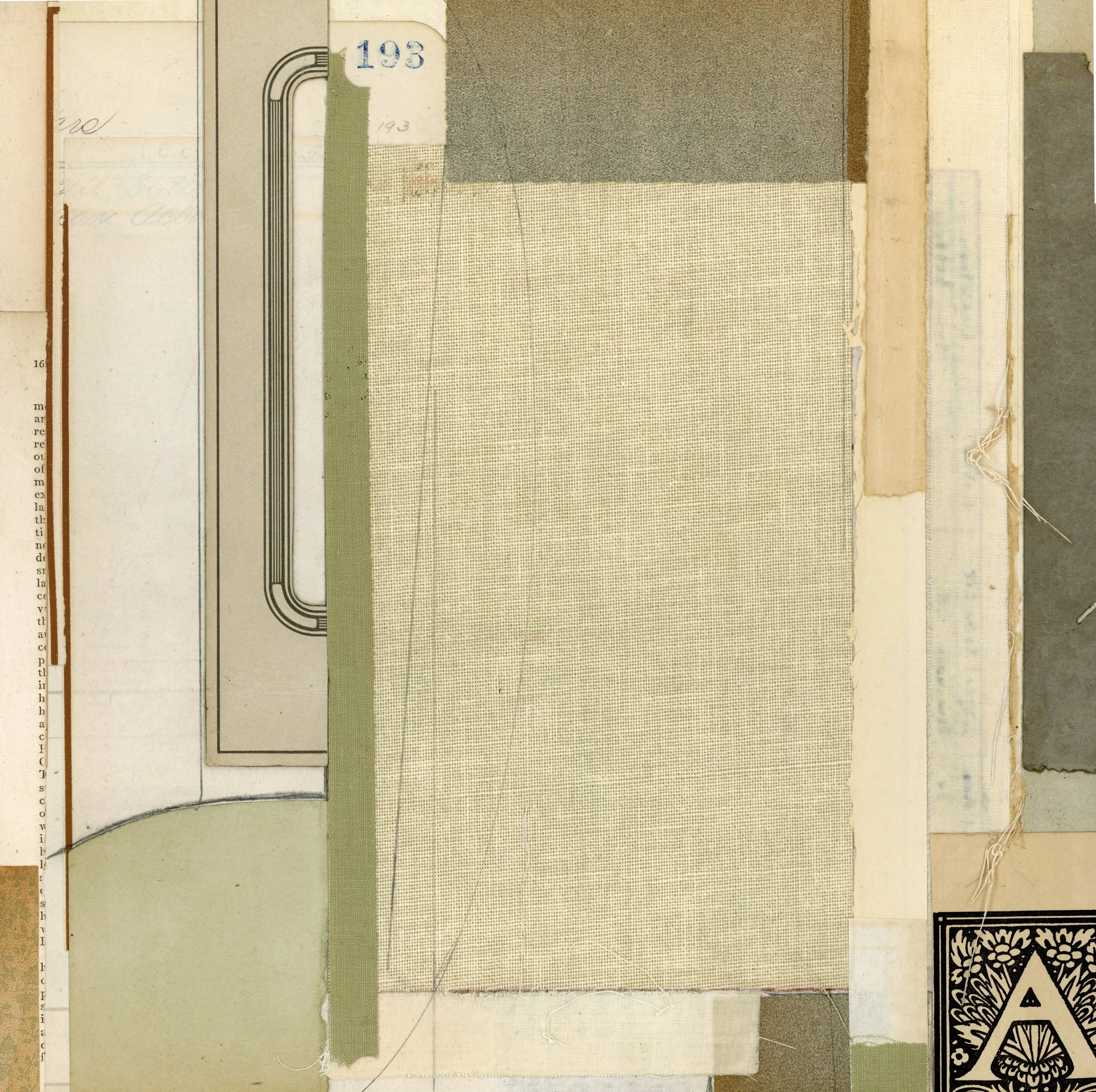
I have drawers and bins full of papers, and as I was working, I pulled out materials I hadn’t been using recently because I’d been creating pieces using letterpress printed papers. I dig into the stack until I find a paper that speaks to me and then I find a way to work it into the composition. If the piece doesn’t look right once it is glued down, I either peel it off or cover it up with something else. I started noticing the patterns and lean into repeating details- a line, a thread, a curve, a color, a texture… those are the details that unify the piece.
In this collage, I used a piece of pressed paper frame removed from a vintage photograph. I had to use Golden Extra Heavy Acrylic Gel Matte Medium for this piece and layer some weight on top before it would adhere. The dark piece on the far left is another bit of this material. I find these frames in antique stores and they are often expensive, so I only have a few that I’ve found that were affordably priced ($2-$3 each).
The letter “A” on the bottom was another surprising addition, as I usually abstract typography, but this piece, taken from sheet music from 1901, was too lovely to cut. I’m not convinced that I’ll leave it, as it’s a very strong focal point in an otherwise quiet piece.
My color choices came about because of the brown lines on the left, which directed me to use earth tones. I tried adding some red but removed the pieces. I tried adding more black, but it was too shiny, and some blue, but I couldn’t find the correct shade (they all seemed too bright). I think this piece looks vintage, not just because of the vintage materials, but because the colors look like old books on a library shelf.
The composition, if you flip the piece on its side, reads like a landscape. I almost always choose this form, especially if I want to make something without too much thought because I’ve made so many pieces like this that my hands and mind work together. In the end, I spent three hours working on this collage. I’ll let it rest before sealing the piece. You can read about the process of preparation and sealing in this blog.
She Didn’t Want a Picture
12” x 12” x 1/8”
Materials: fabric book cover, end papers, railroad ledger page, sheet music, book pages, paperback book cover, pressed paper photo frame, handwritten notes (ink pen), fabric removed from the back of a map, pencil.
Disclaimer: This post contains affiliate links. If you use these links to buy something I may earn a commission. Thank you for helping to support this blog!