Sketchbook Challenge: Typography
Last month, my sketchbook challenge was to work only with one type of paper and a very limited color palette. My first ten collages weren’t very interesting, but the next fifteen were. I used one of the collages as a study for a scaled-up work.
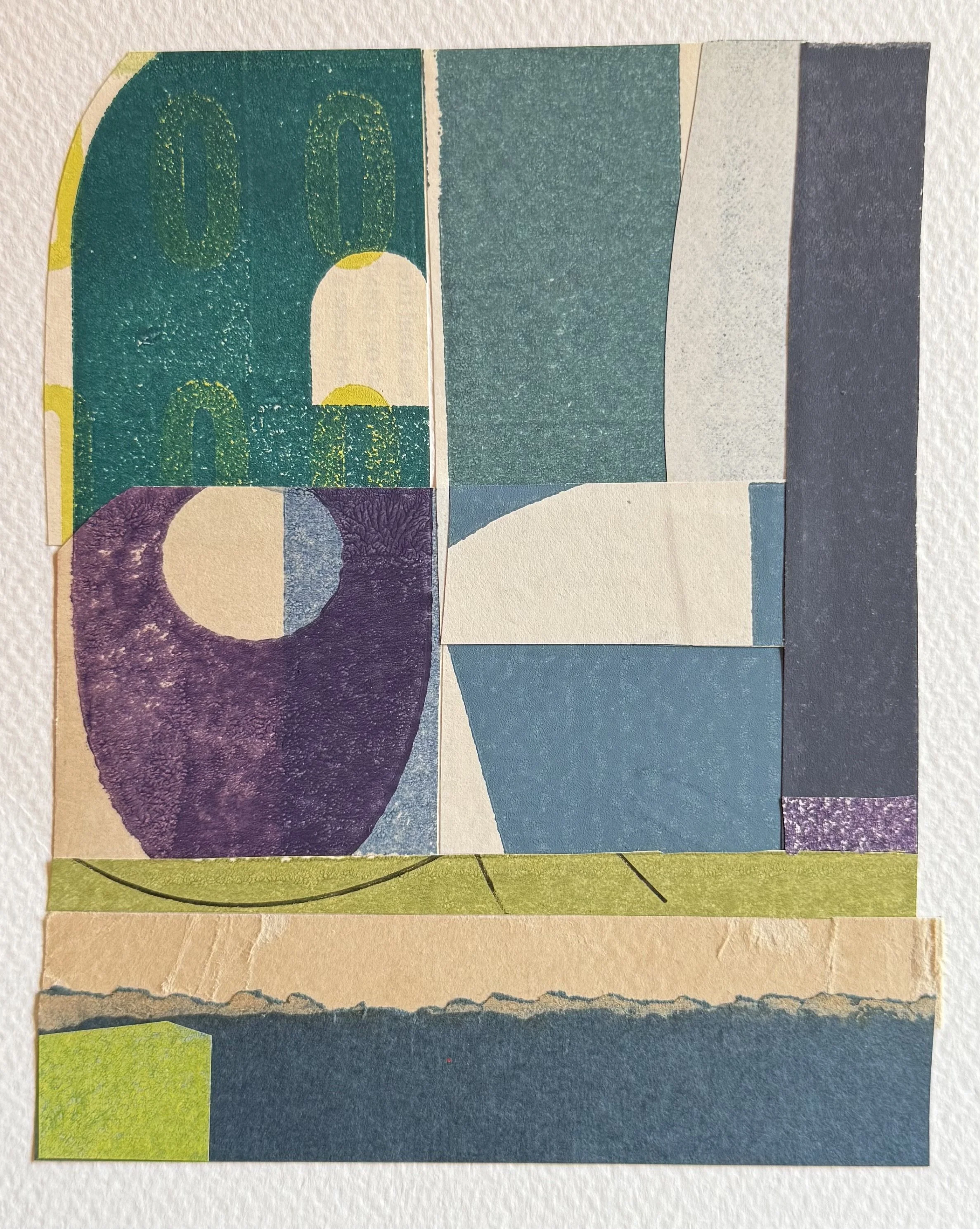
This month, I’ve been focusing on another challenge from the Scraps sketchbook class: creating abstracted typography collages with letterpress prints.
(The kind you’d create in my collage and printmaking class, Impressed.)
I’m finishing one collection and thinking ahead to the next, where I want to explore something new, or at least something I haven’t explored in a while. I’m thinking about color, and I’m thinking about the shapes in letterpress prints and printed papers that will give me new forms to abstract further.
Lately, I feel like I’ve created a lot of work where I cut the type down into things that no longer look like type. They just look like blocks of color. I want to return to some shapes I’ve worked on before and switch up my color palette.
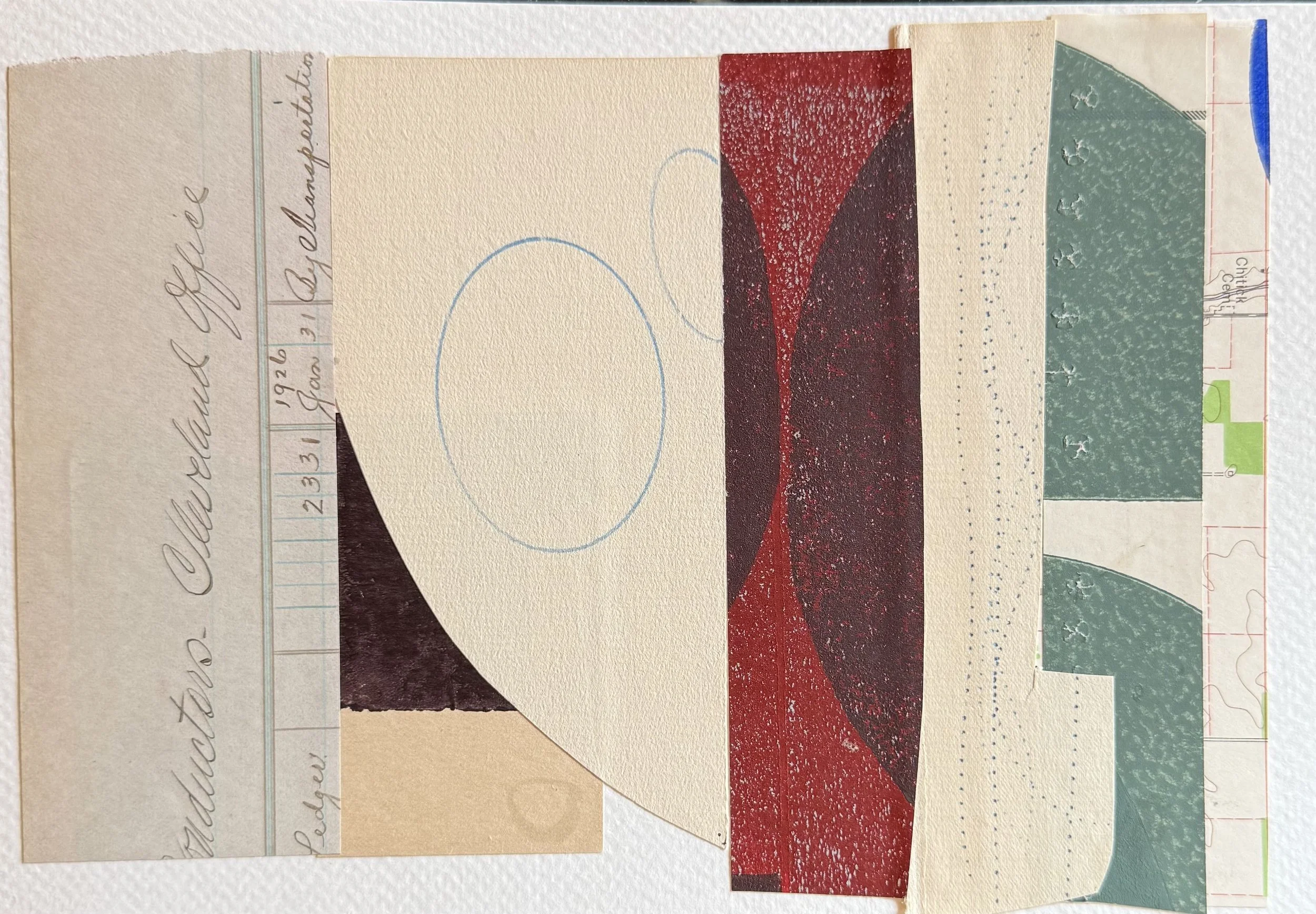
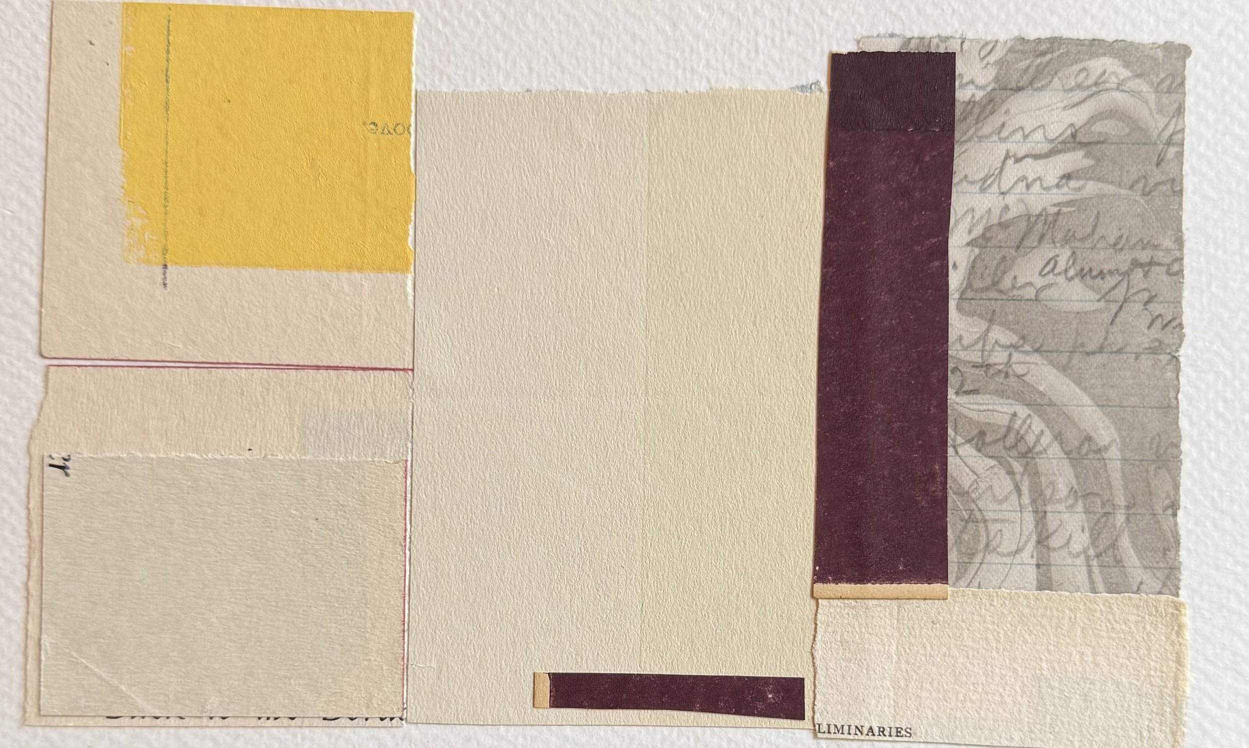
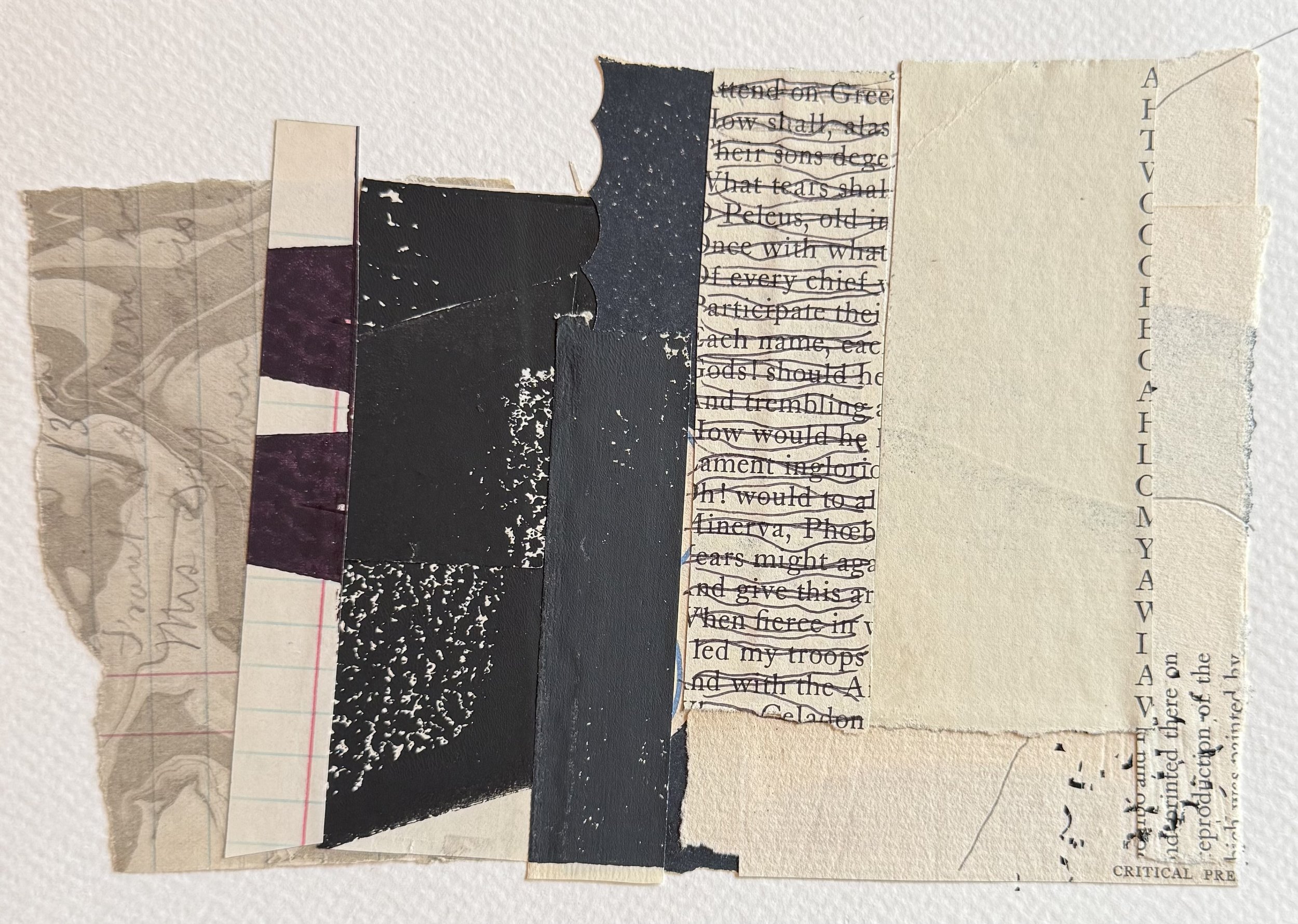
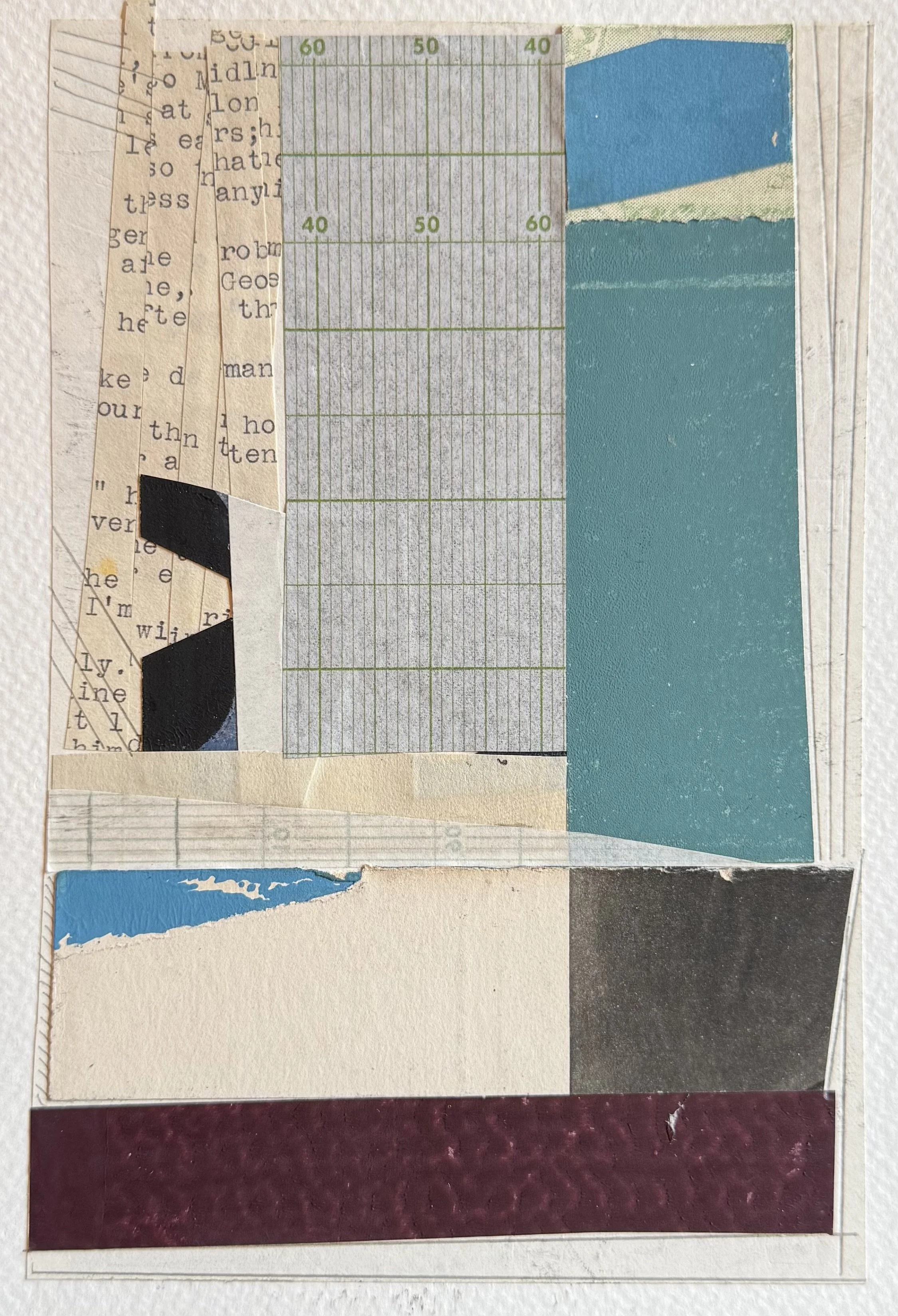
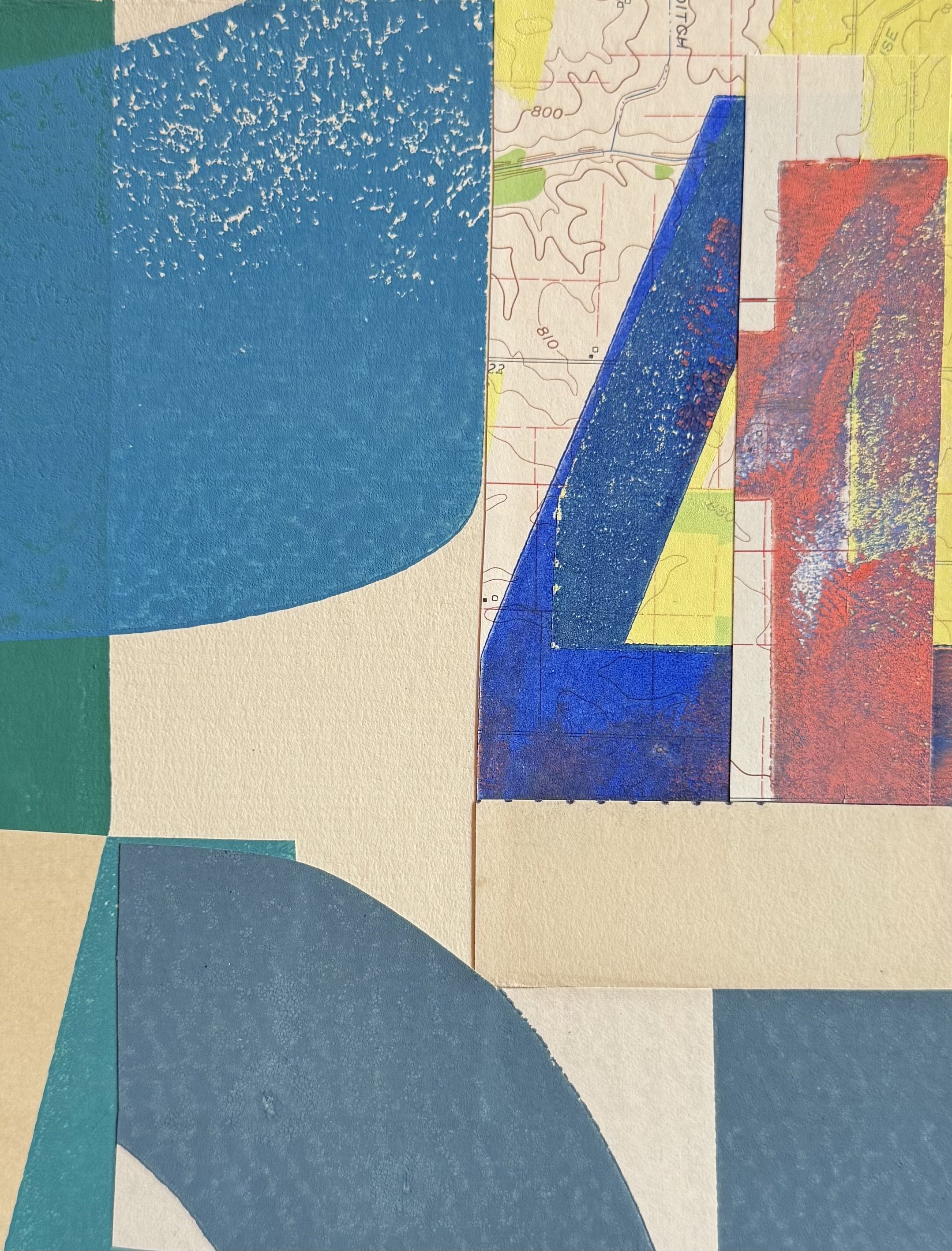
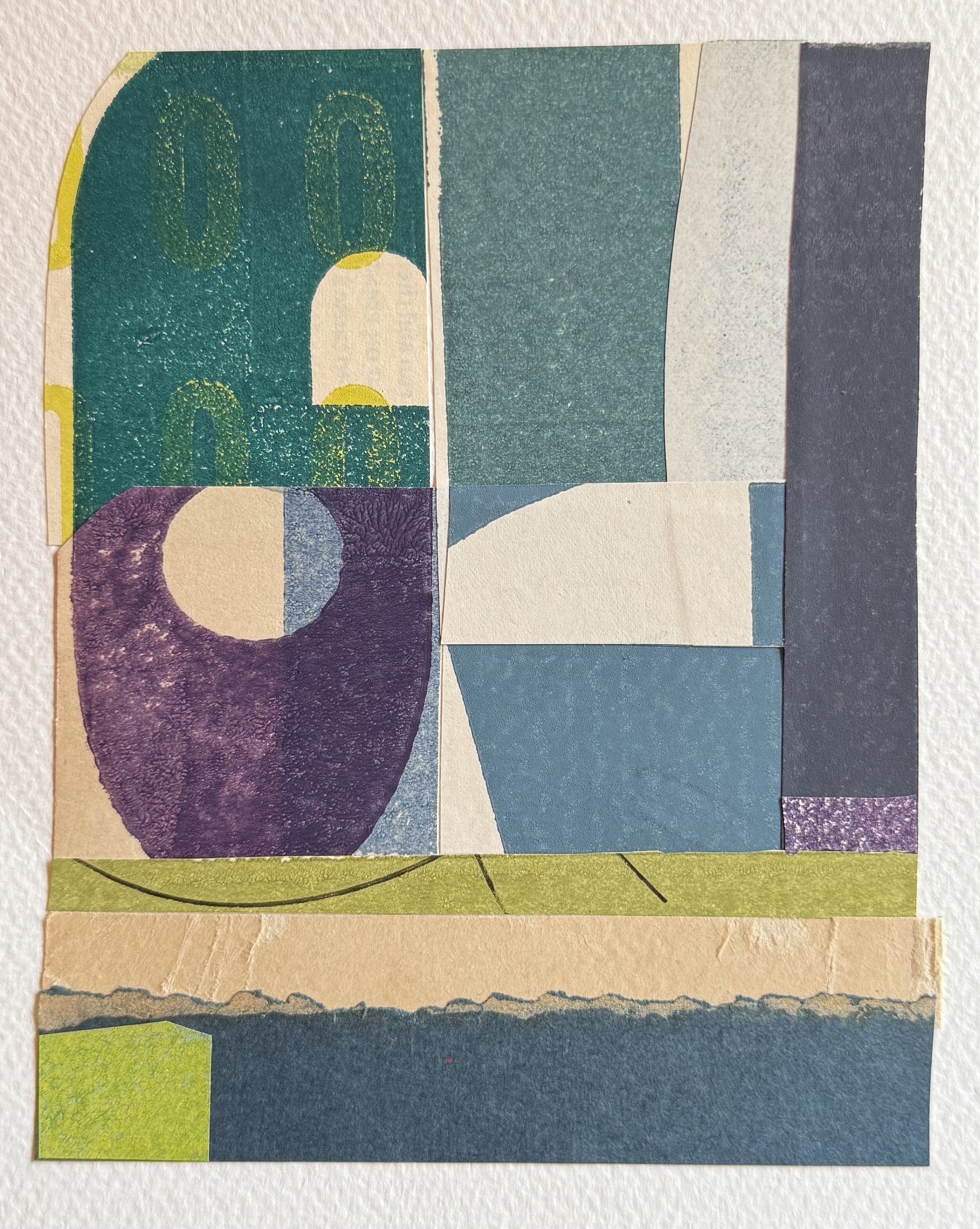
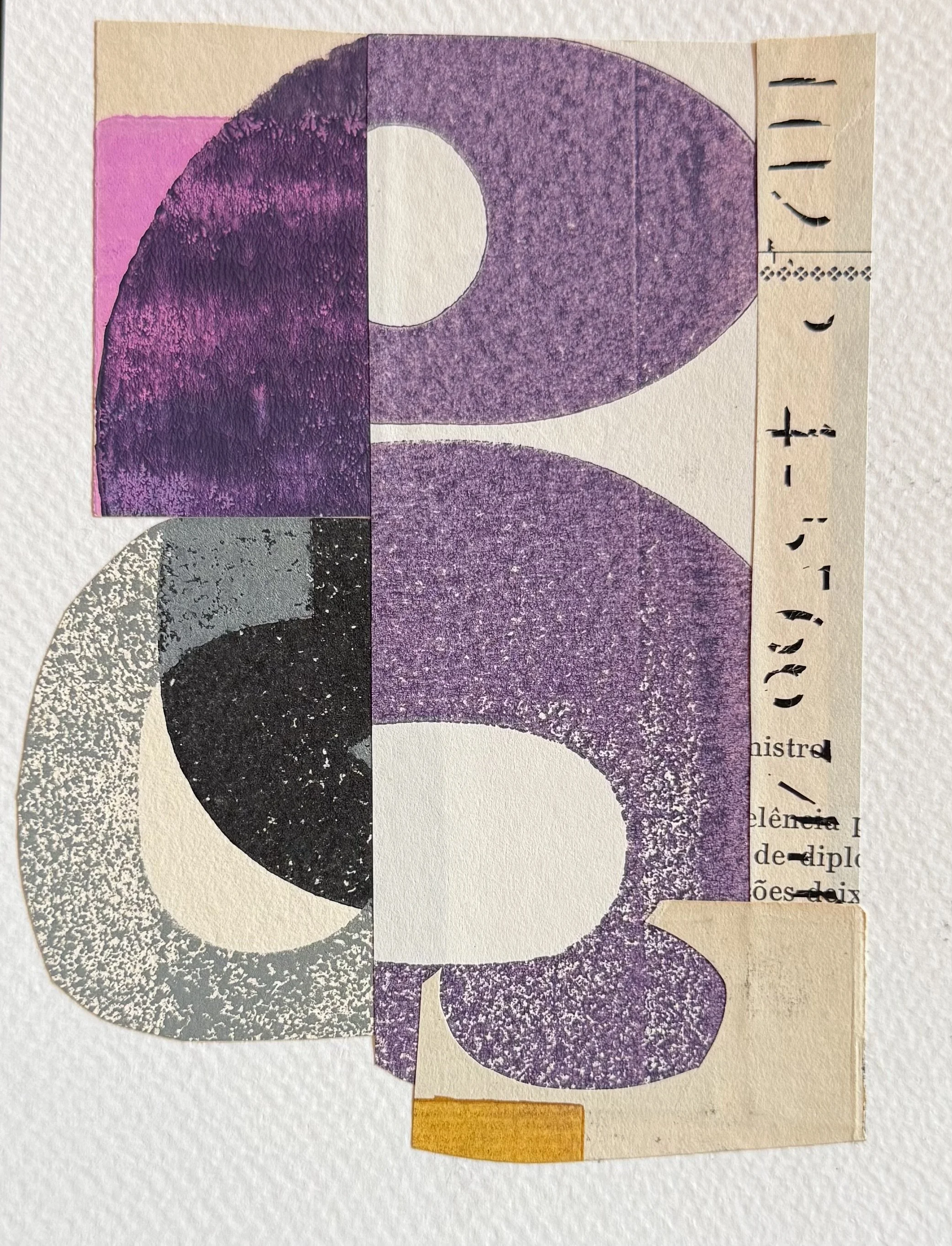
Over a couple of weeks, I made 15 little compositions. Because my scraps tend to share the color palette I’m working with, the collection in my sketchbook hangs together as a series. I tried different compositional strategies and added more personality to the papers so my own marks would show. I added marks on top so that the work would feel like mine, and not like everyone else’s abstracted typography collages.
There are little bits in these that I really, really like. Some of the added marks worked really well, and so did some of the compositions. Others were too chaotic, and others were too boring. In other words, it was all over the place.
As I keep working through these ideas, I might print papers in a specific color field and bring them back into the sketchbook. The real challenge is that I’ll have to print really small letters so I can manipulate them into shapes, because many of my prints use massive letters that are too big to work with in a sketchbook.
This is what I love about printing my own paper: when the scraps aren’t working, I can go back to the press and make what I need. Smaller type, different papers, the colors I want to work with. This is the process I teach in Impressed- the many ways to create letterpress-printed papers (even if you don’t have a press).
Sketchbook practice lets you explore ideas, but it also reminds you of its limitations, and it gives you the energy to stretch into larger works to solve the problems that arose while you were working in the sketchbook.
Materials
Letterpress-printed paper scraps or pages from text-heavy magazines.
Small sketchbook or loose sheets of paper (I’m using Fabriano Watercolor paper cut to 9” x 6”)
Adhesives and Tools
Kokuyo Gloo Square Glue Stick
EK Success Cutterbee 5” Scissors
Teflon Bone Folder or old credit card/hotel key
Supporting Materials
Envelope for scraps
Old magazine or loose sheets of scrap paper for a gluing surface
Pencil
Unwaxed deli paper
Pouch/box to store your supplies (I use the Keeper Pouch from Peg & Awl)
If you try this, let me know how it went and what you learned.