Mixing Unique Paint Colors
Are your paint colors coming right from the tube?
I did that for a long time because color mixing seemed like an advanced skill. I was afraid to use color and many of my early collages were in black and white.
The gelli plate changed this because I never cleaned the plate between prints, which meant I was mixing colors without meaning to. Initially, there was a lot of muddy color, but practice and experimentation led to improvement.
When I started letterpress printing, I had the same problem. I used acrylic paint on disposable palette paper and would roll out a single color, print until I ran out, trash the palette paper, and start again with a new color.
That was boring.
Then we inherited some bureaus with massive sheets of tempered glass used to cover the tops, which I repurposed in my studio as a replacement for palette paper.
I bought some used Pantone books, because that's what I saw letterpress printers doing, and went to work.
Total fail. Pantone books do not work for mixing acrylic paint colors. You need a scale to measure out your colors, and certain mixes of color to begin with (and what is transparent white??). I tried to get close to the colors in the books, mixing little bits of this and that on my tempered glass, but ended up with either mud or colors that were nothing like what I wanted.
I gave up and just started experimenting by not cleaning up after I printed a color. (Sound familiar?) Colors started making sense, and I knew if I added a bit of purple to black, or gray to red, or a tiny bit of white to a mix, I could get interesting colors. I never take notes as I print, so replicating an exact shade of red might never happen again, but I'm okay with that because it's so much fun to work this way.
If you work this way with the same paints for a long time, you'll also end up with a unified color palette in your papers for your next collage.
Here's how I work:
Choose a limited number of colors- a mix of Golden SoFlat and Golden Open Acrylic paints
On the tempered glass, I'll mix small amounts of two or three until I get a color I like
Letterpress print until I run out of the color
Use a paint scraper to gather whatever is left of the paint into a little pile
Add another color or two and mix it all up
Print again.
Repeat the process until I run out of space to dry the paper
Clean up by putting a piece of scrap paper down over the remaining paint and roll your brayer over the top. Save or discard the scrap paper. Clean up the brayer, glass top, and palette knives with alcohol wipes or hand sanitizer on a paper towel.
This isn't only for letterpress printing. Switch up as needed for gelli plate printing or painting.
If you're looking for a starting point for your colors, I highly suggest the Magic Palette. Sometimes I'll begin my color choices by finding a color I like on the magic palette, using their instructions to mix it, print with the color, and then choose a few more colors to add to that original mix.
Magic Palette Coloring Mixing Guide
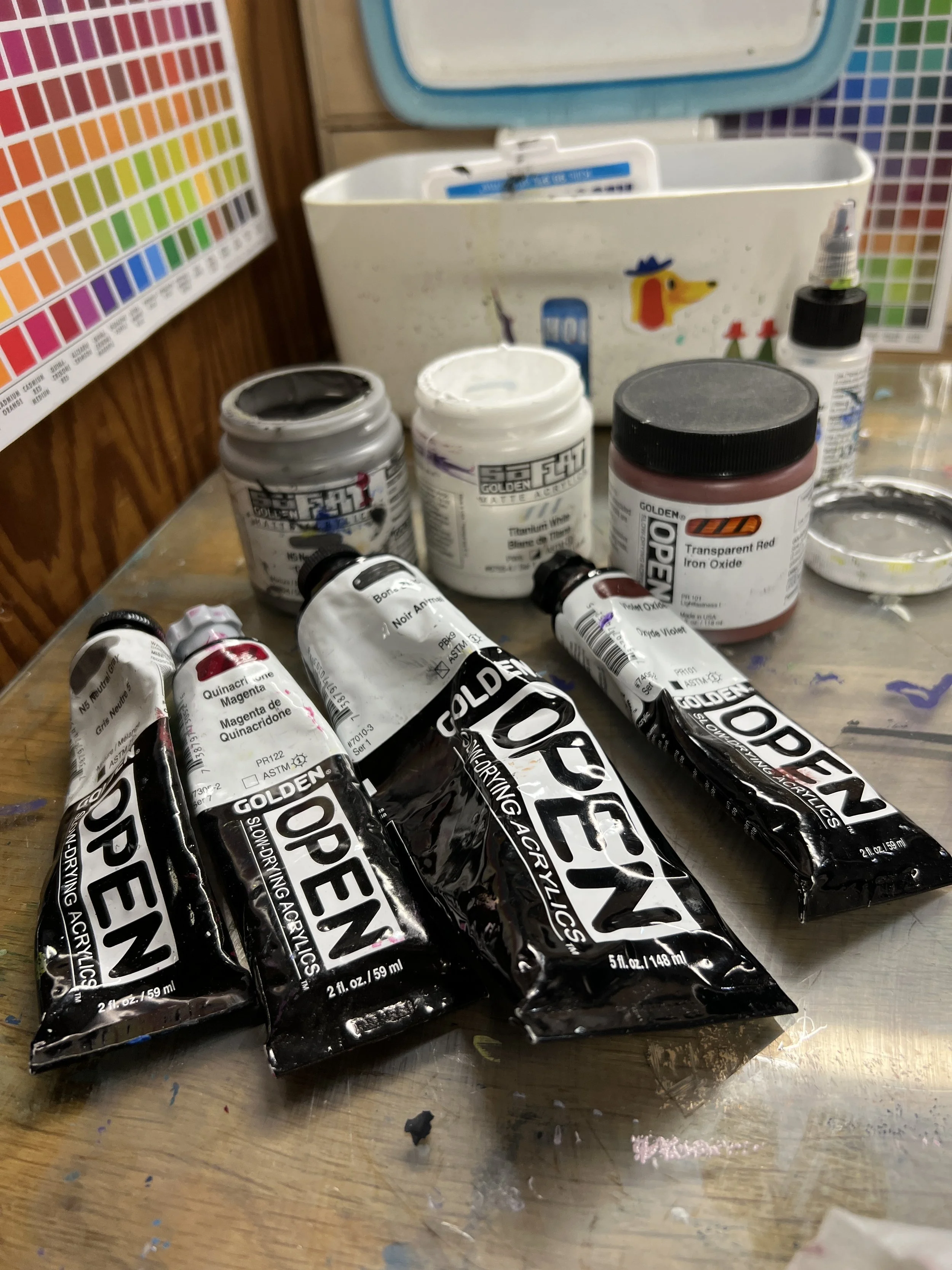
A Recent Color Mixing Palette:
Transparent Red Iron Oxide (Open)
Titanium White (So Flat)
Bone Black (Open)
Violet Oxide (Open)
Quinacridone Magenta (Open)
Neutral Gray (Open and SoFlat)
So Flat Paints- Matte, opaque colors
Golden Open Paints- transparent, slow drying time

The colors I mixed (all letterpress prints)
I'm printing on vintage papers, toned to various shades of cream/yellow, which impacts the final color. You'll see different results on new, bright white paper

The collage I made with the papers. I used my clean-up sheet ( from a vintage music book) as my background for the collage. I added some blues from another letterpress printing session.
I’d love to hear about your struggles and successes with color mixing. Is there one technique that has really helped you?
PS Some of the above links are affiliate links.